CHALLENGE
To create a premium visual identity for a body care studio that combines advanced technologies with a calm, holistic approach to wellbeing.
The challenge was to move away from the typical beauty and fitness aesthetics and communicate lasting results, balance and confidence.
DESIGN DIRECTION
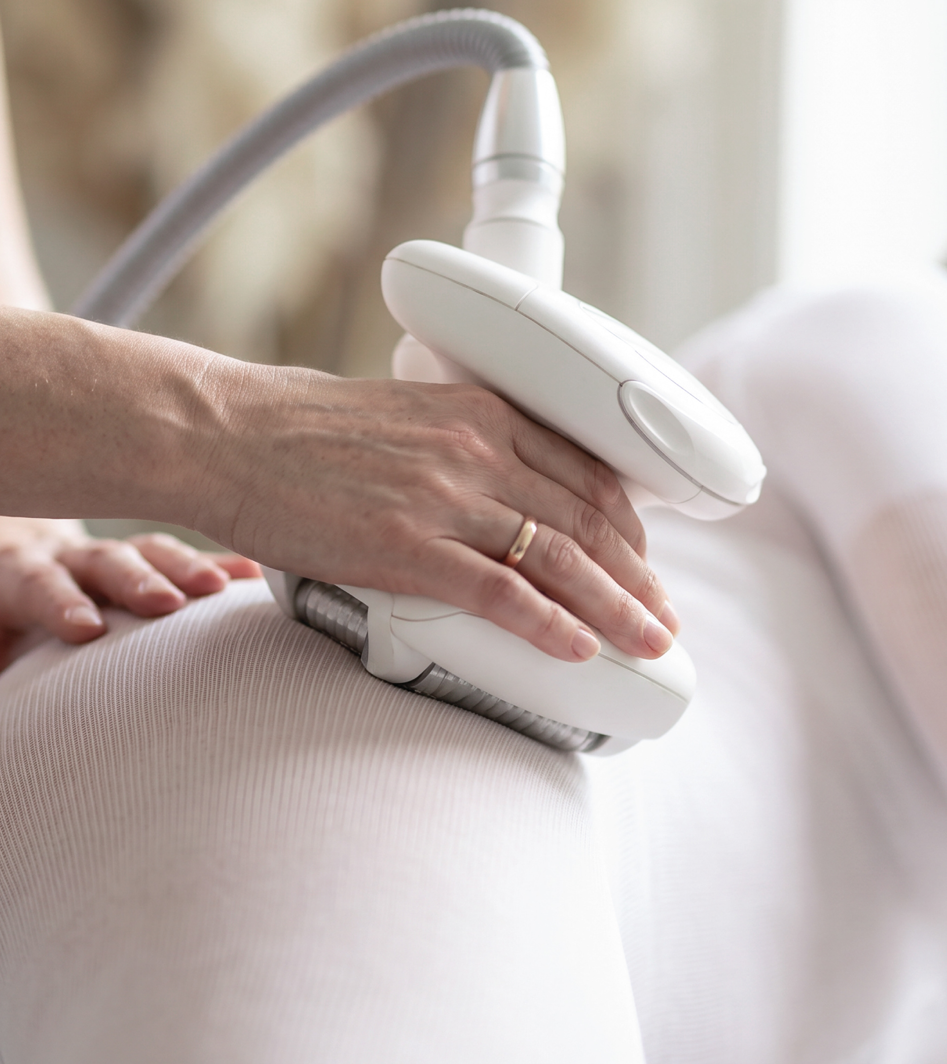
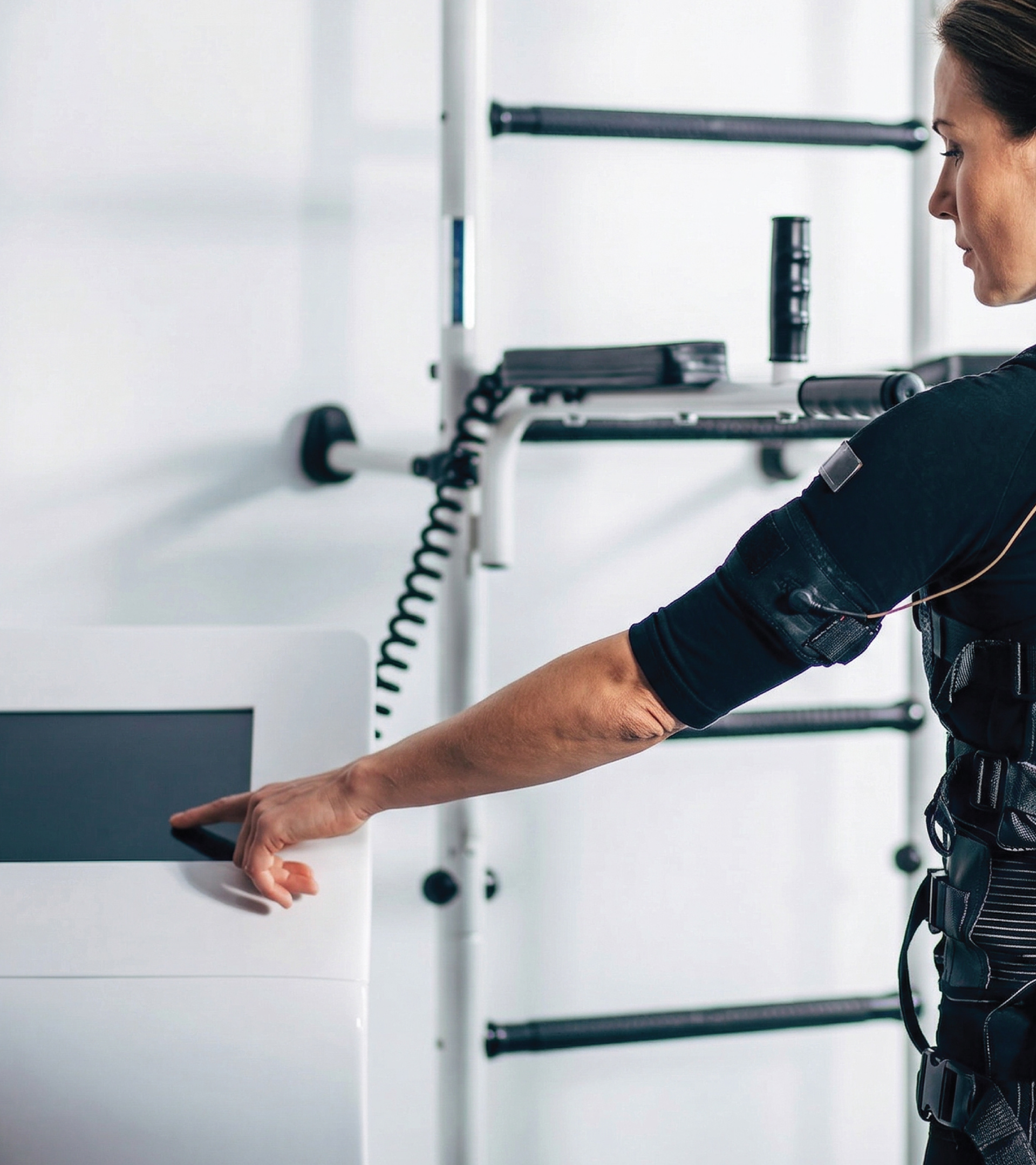
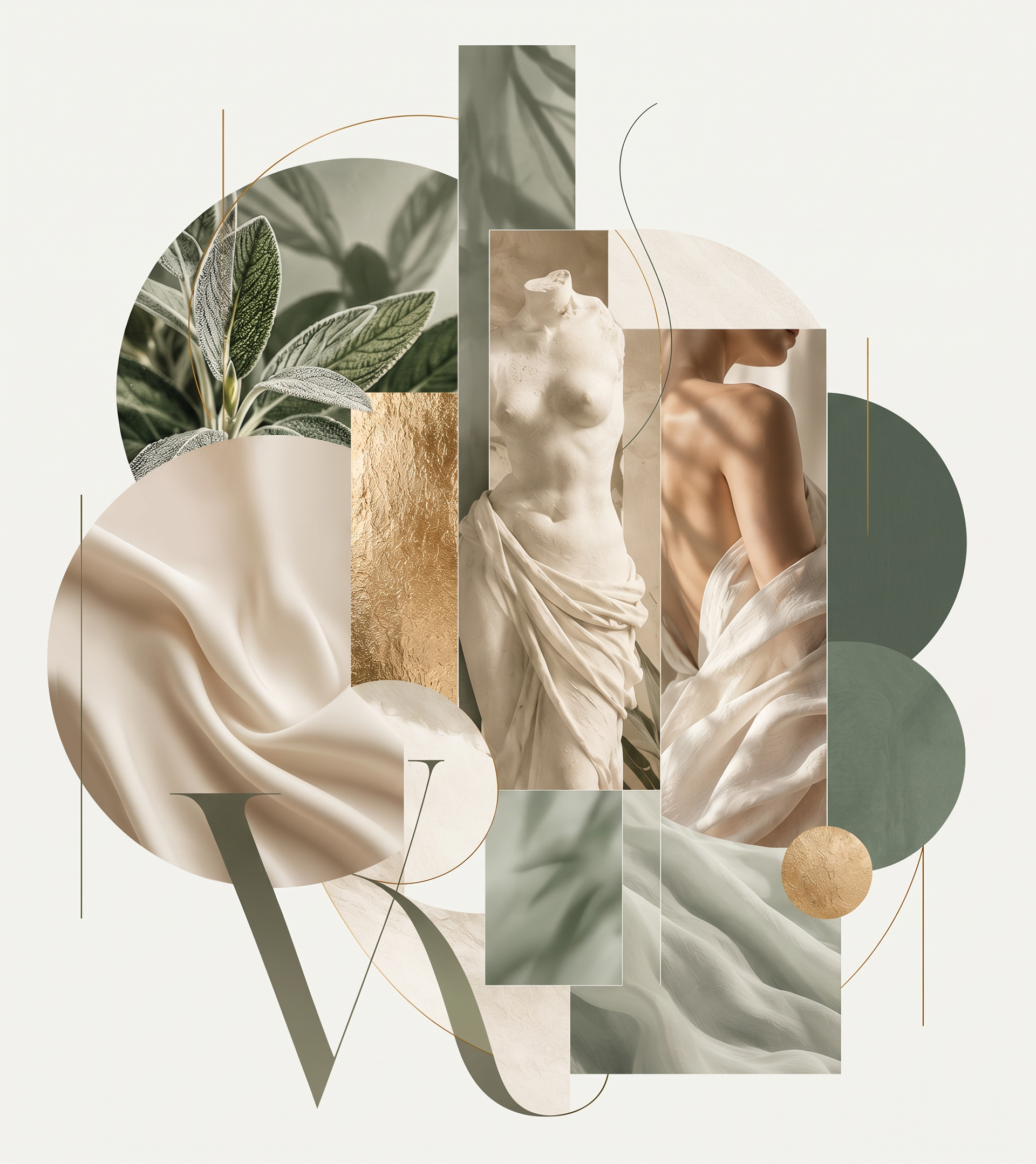
The visual direction was built around three ideas: balance, the natural form of the body and understated premium care.
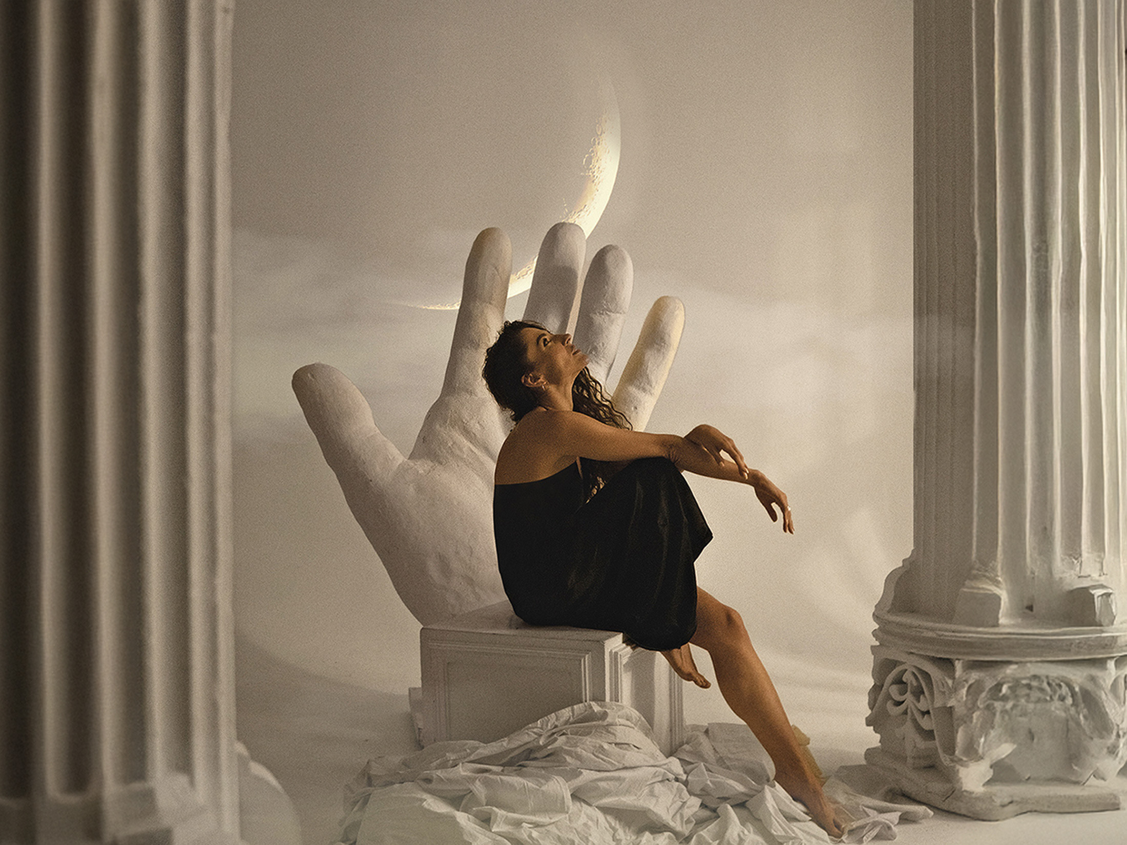
Classical art and organic shapes inspired the symbol, while sage tones, warm neutrals and muted gold created a calm and sophisticated visual language.
LOGO CONCEPT
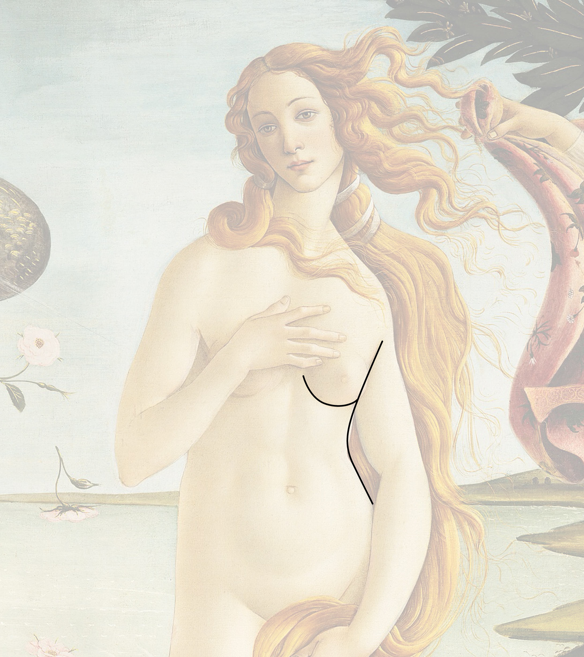
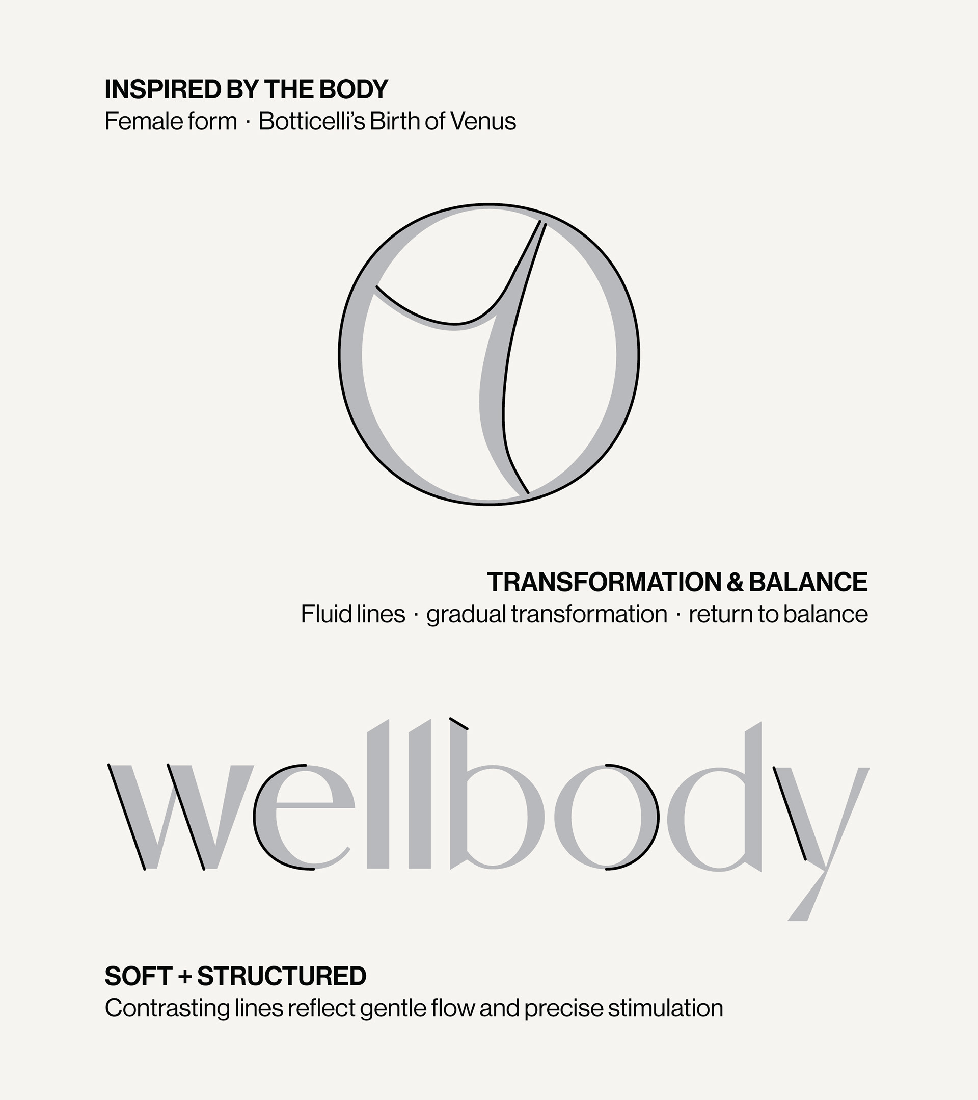
The symbol was inspired by the natural curves of the female body and classical representations of beauty, particularly Botticelli’s Birth of Venus.
Its fluid lines suggest gradual transformation and a return to balance, while the enclosing circle creates a sense of a safe, focused space for restoration. The internal structure reflects a deeper approach to the body as a system, reinforcing the idea of lasting change rather than an instant result.
LOGO SYSTEM
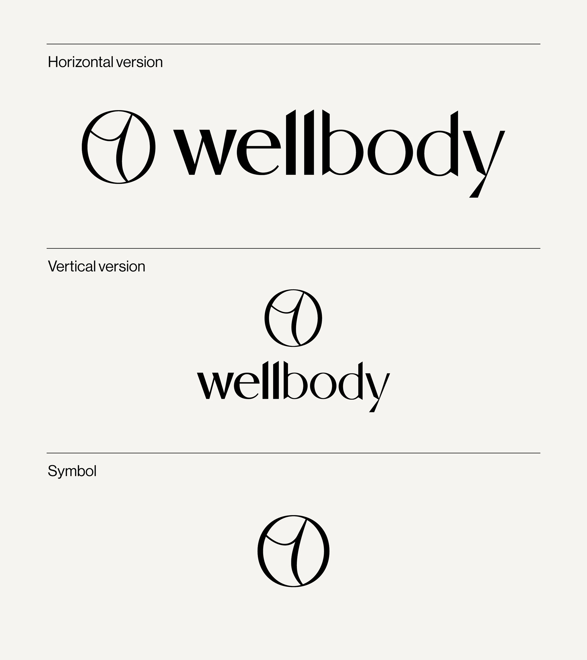
The identity combines a refined wordmark with a flexible symbol that can work independently across different brand touchpoints.
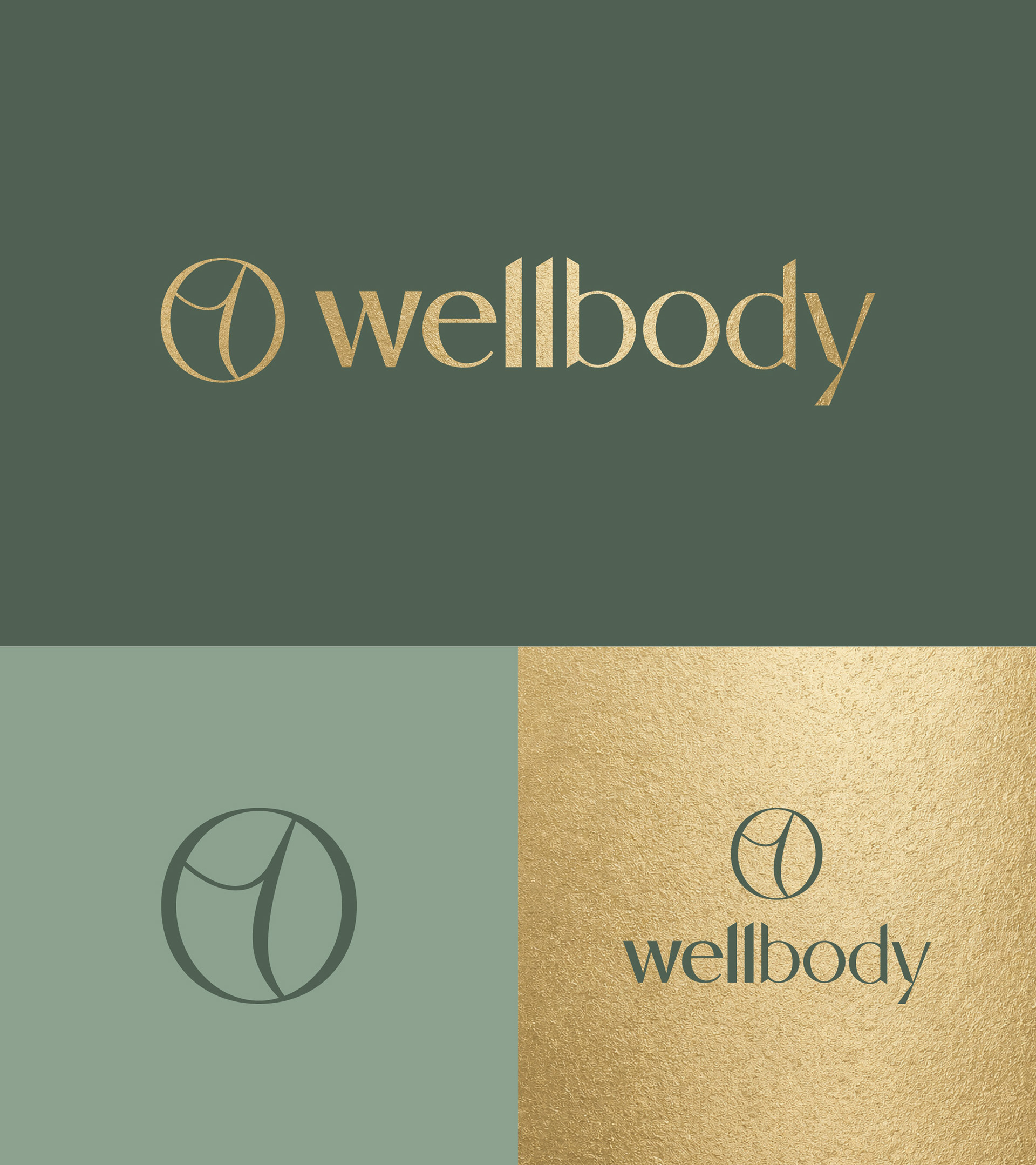
Several logo configurations were developed to maintain consistency across digital, print and small-format applications.
COLOR SYSTEM
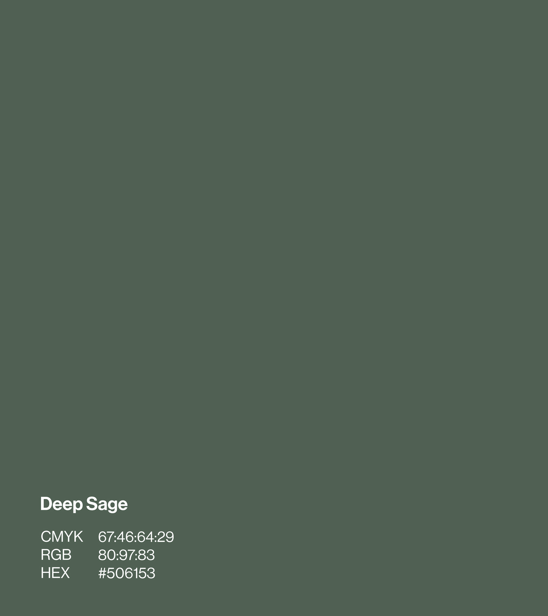
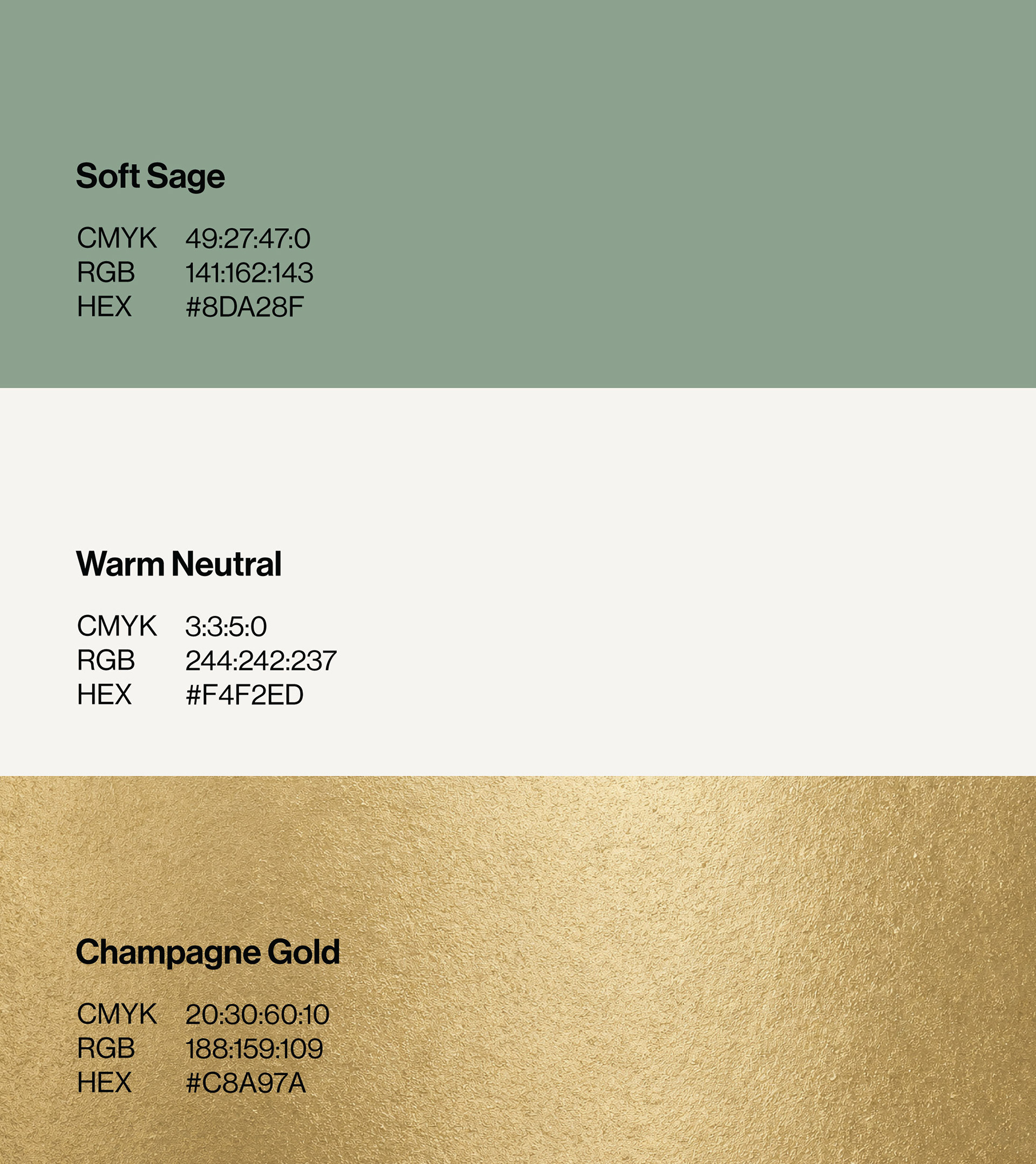
The palette was designed to balance wellbeing and premium positioning.
Sage greens communicate restoration and calm, warm neutrals create space and softness, while muted champagne gold adds a refined premium accent.
BRAND APPLICATIONS
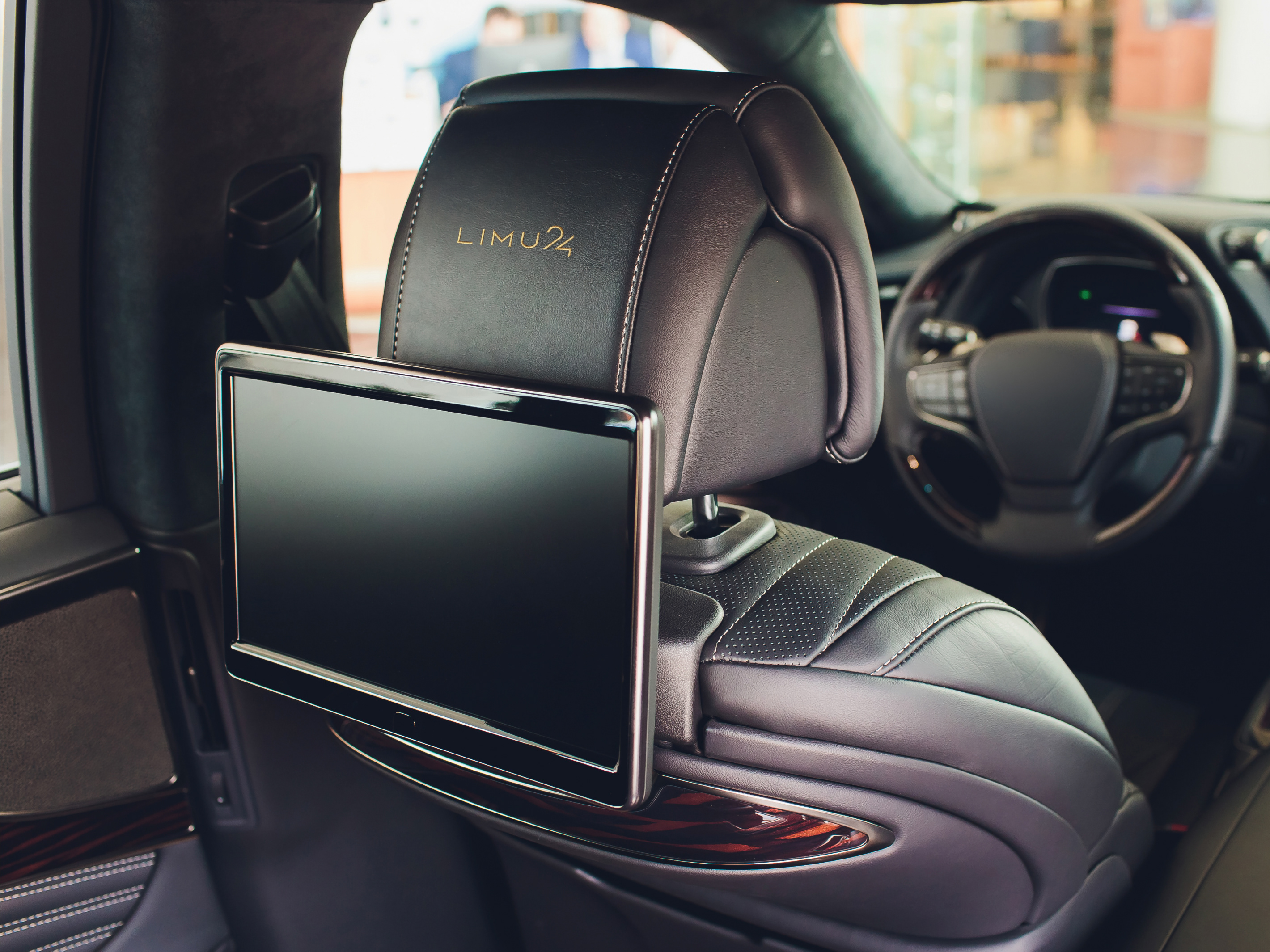
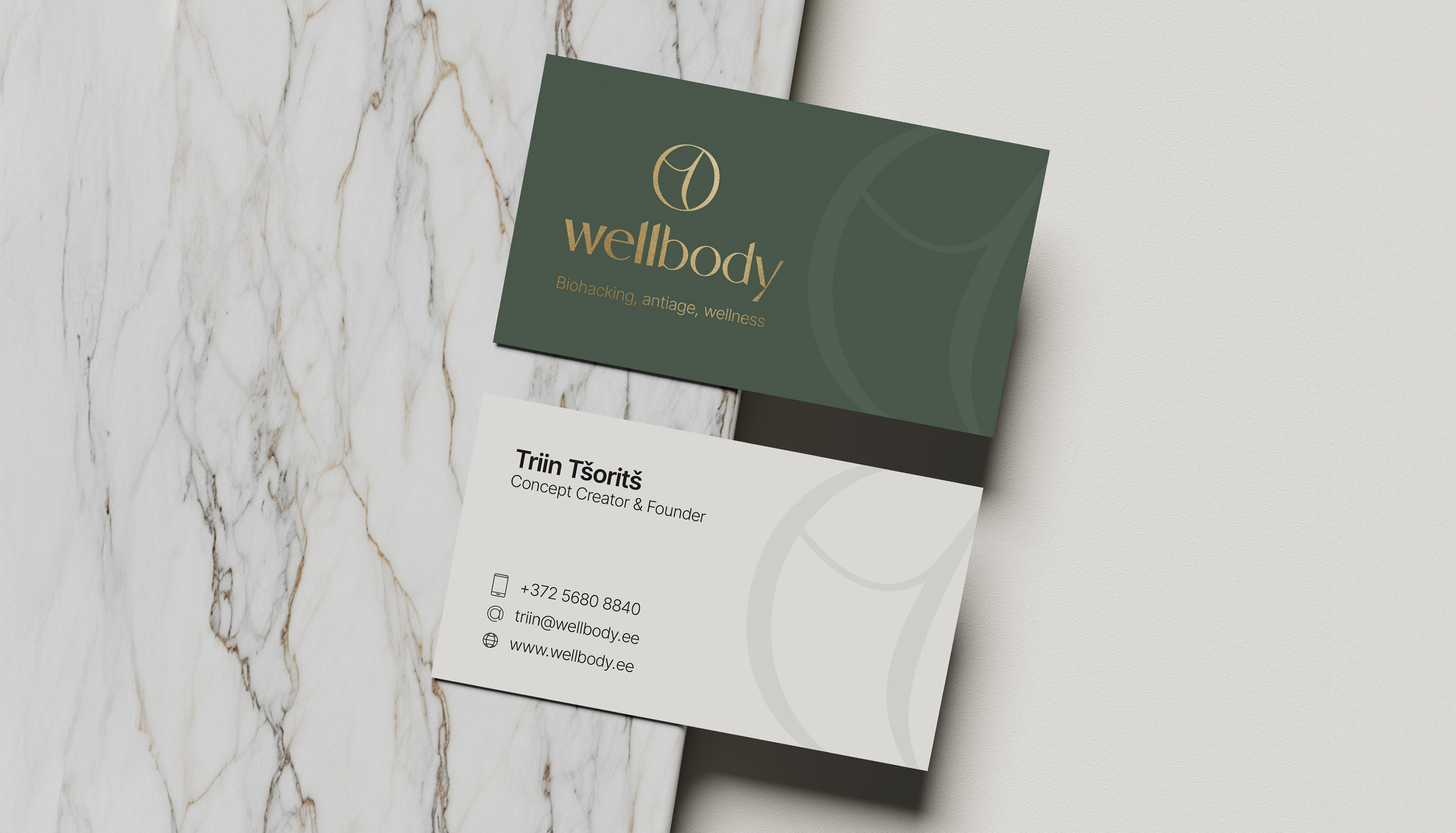
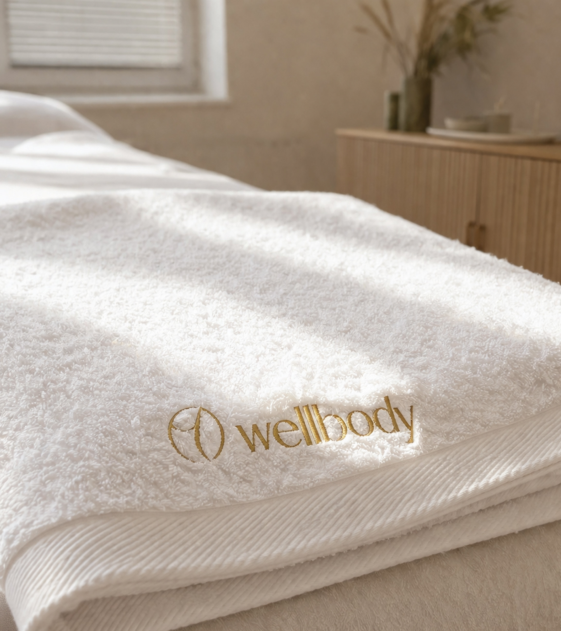
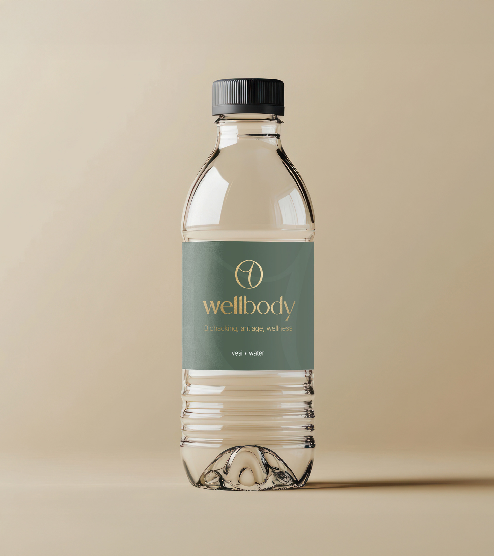
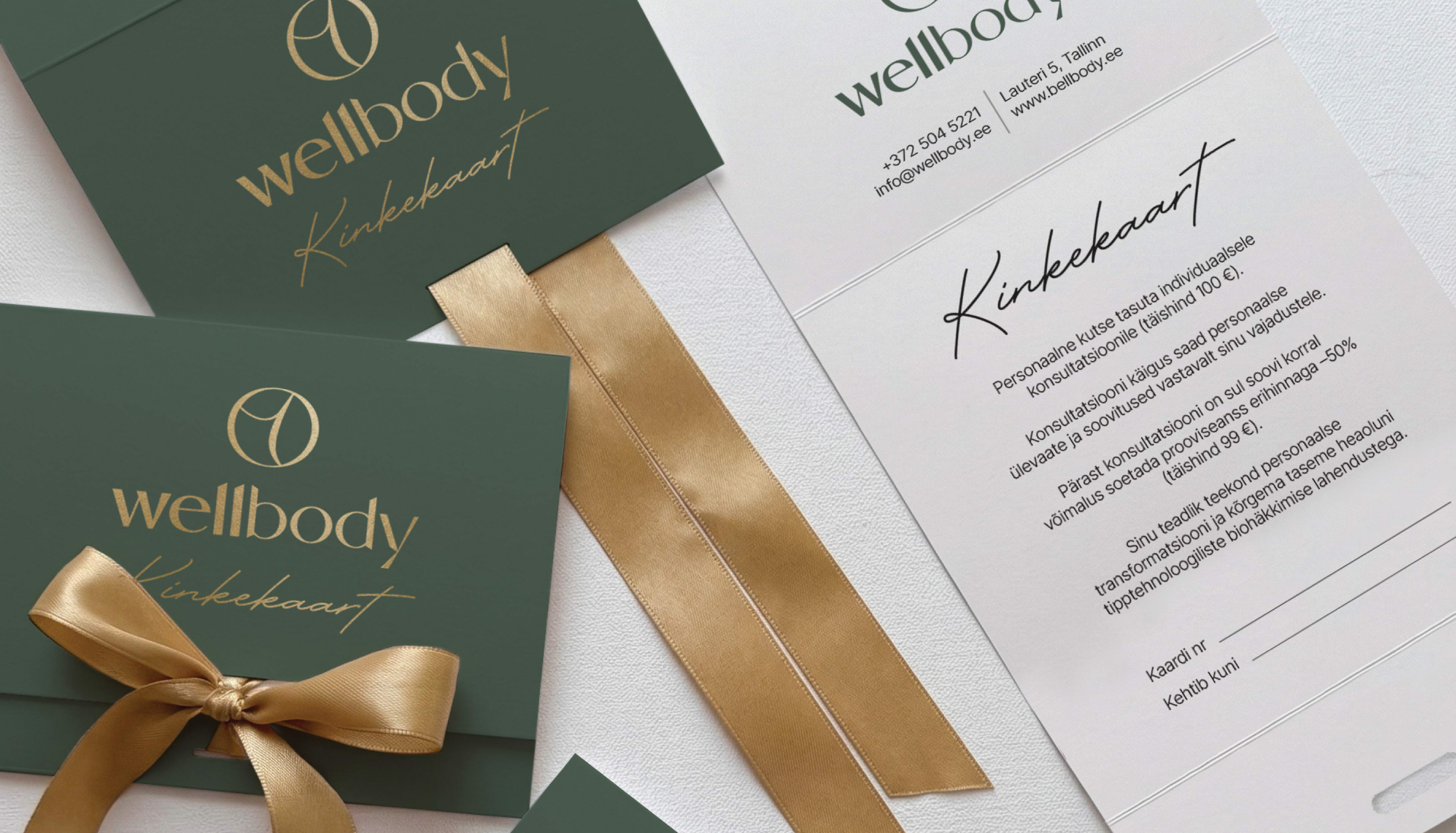
The identity was extended across physical brand touchpoints to create a consistent experience beyond the studio itself.
RESULT
The final identity gives Wellbody a distinctive premium presence while maintaining the sense of calm, care and balance at the heart of the brand.
The flexible logo system and restrained visual language create a consistent foundation for both digital and physical brand applications.
Have a project in mind?
I’d be happy to hear about it.
I’d be happy to hear about it.